3. Display modes
Displaying images for processing is done in two types of display windows.
The first is a “Thumbnail window” that displays a list of images for processing. The other is a “Preview window” for large display of only one selected image.
The “Preview window” offers functions that divide the window in two for comparing two images or comparing results from adjusting different development parameters of the same image.
Five display modes are available in SILKYPIX Developer Studio Pro9 / 9 through the combination of these two kinds of windows.
Thumbnail mode
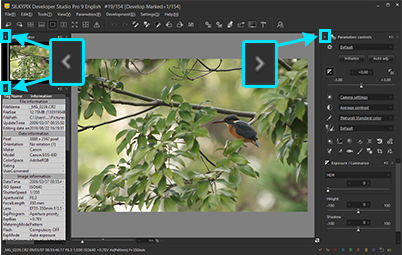
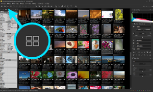 The thumbnail mode is a display mode in which the “Thumbnail window” is located in the main window and the preview window is not displayed.
Preview mode
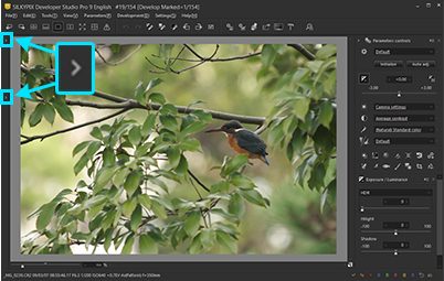
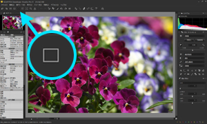 The preview mode is a display mode in which the “Preview window” is located in the main window and the thumbnail window is not displayed.
Combination mode
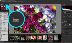 The “combination mode” is a mixed mode of the “thumbnail mode” and “preview mode”, displaying Thumbnails and single view at the same time.
You can change the location of the “Thumbnail Window” and “Preview Window”.
Make changes to location from sub-menus under “Arrange on main window,” displayed by right clicking on “Thumbnail Window”.
You can change the location of the “Thumbnail Window” and the scroll direction of Thumbnails from the Display settings.
You can change the number of images available for display and size of thumbnails in the “Thumbnail Window” by dragging between the “Thumbnail Window” and the “Preview Window.”
Please refer to “3.3.3. Changing the Size of Thumbnails” for details.
In addition, there are special display modes in both the “Preview Window” and the “Thumbnail Window”.
Full Screen Display for “Preview Window”

This mode is for displaying the “Preview Window” on the full screen. You can enter this mode by clicking on the “Full screen preview” button in the toolbar.
The overall ambience of the photograph can easily be checked by using the full screen preview.
In addition, if you use a multi monitor environment (with two or more monitors), the preview can be displayed on a monitor separate from the monitor with the main window.
You can perform editing by locating the controls on the sub-monitor while displaying the photograph on the full screen of the main monitor.Floating Display of “Thumbnail Window”
This is the mode for displaying the “Thumbnail Window” as a floating window.
Changing to a floating window can be set from the context menu displayed by right clicking on the top of the “Thumbnail Window”.
The scrolling direction of the “Thumbnail Window” while a floating window is the same as the scrolling direction under Combination Mode.
Special display conditions are conditions under which both the Thumbnail Mode button  and the Preview Mode button
  are selected at the same time.
Under these conditions, when you click the button corresponding to the window for the special display conditions, you can switch between Display / Close Display for the window.
3.1. Switching Display Modes
Switching to “Thumbnail Mode,” “Preview Mode” and “Combination Mode” can be performed at any time with [View (V)] in the menu or with the toolbar icon.
If you double click a selected image in “Thumbnail Mode,” it will switch to “Preview Mode”.
3.2. Preview window
The “Preview Window” is a window for displaying preview images of selected images.
By opening a preview image of a selected image, you can view the entire image or enlarge just one part to check it.
3.2.1. Multi preview
There is a “Multi preview” Function that displays two screens, separating the “Preview Window” into left and right screens.
There are two multi preview modes. Three examples of ways to utilize them will be introduced here.
Please make full use of their applications.
Reference preview mode
Of the two displays, make the left display your main preview, and use the right display as a reference preview.
The selected image for adjusting development parameters will always be displayed in the main preview.
There are several ways you can choose images to be displayed in the reference preview, but whichever way you choose, the reference preview display is for comparison uses and you cannot edit development parameters there.(A) Compare preview images of two images
Use this to choose the best scene taken from multiple images.(B) Compare preview images of a single image with different development parameters applied
Use this to adjust parameters and compare parameter adjustments before and after they are made.
Reproduction preview mode
Selected images for adjusting development parameters are displayed on both displays.
You can set options such as display position and magnification for the two images, so you can view one overall image and use the other screen to display partial magnification.
You can also display two important parts of the photograph and decide how to adjust parameters.
3.2.1.1. Operation Methods
Switch to multi preview by clicking on the  icon in the toolbar.
The status of the multi preview display is shown at the top of the screen in the icon bar as seen in this figure.
You can change modes and preview displays with these icons.
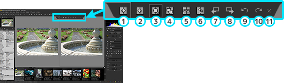
To reference preview
Display the image shown in the main preview in the reference preview as well.To main preview
Display the image shown in the reference preview in the main preview as well. (*1)Reference preview mode
This is a mode for displaying different images on two screens and comparing.
You can compare different images or different development parameters of the same image.Reproduction preview mode
This is a mode that displays one image in two screens.
You can adjust development parameters while looking at two parts of the image.Link display mode
This is a mode for linking display position and magnification on two screens.
You can turn this on / off.
When this mode is on, you can move or resize images keeping the relative relationships of the two images currently displayed.
Turn off this mode if you want to change the relative relationships of the two images or if you want to move or resize an image on only one screen. (*2)Initialize display position
Initialize location and magnification of images in the reference or reproduction previews, and match with the main preview display status.Previous image
Change the image displayed in the reference preview to the previous image. (*3)Next image
Change the image displayed in the reference preview to the next image. (*3)Return to history
Return to the editing state of the image displayed in the reference preview one step before. (*4)Proceed to history
Advance the image displayed in the reference preview to the state of the following editing step. (*4)Close
Close multi preview and return to a preview with one screen.
*1 This is effective only when the image displayed in the reference preview can be selected as an image for editing.
Images displayed in the reference preview cannot be run if there is a past editing history or if it is an image already closed.*2 “Link display mode” status is reflected by pushing the [Ctrl]+[Alt] key and only while it is held down.
Use this for when you want to temporarily turn off linkage in order to change the relative relationship of two images.*3 This works only during reference preview mode.
This cannot be used if in reproduction preview mode.*4 This function is used for comparing differences in development parameters for one image.
Images displayed in the main preview and the reference preview must be the same.
This works only during reference preview mode.
This cannot be used if in reproduction preview mode.
3.2.1.2. Selecting Reference Preview Images
You can display an image different from the main preview image in the reference preview or different development parameters for the same image as the main preview.
Switching images displayed in the reference preview
(A) Switching to previous or next image with the icon bar
Use the and
and  icons on the icon bar to go to displays of the previous or next image.
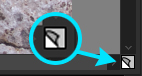
(B) Switch by clicking on an image for display on the thumbnail window.
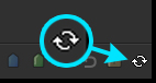
The icon is displayed to the lower right of the image when the mouse is moved over the image to be switched on the thumbnail window.
You can display the designated image in the reference preview by clicking on this icon.
You can also display the designated image in the reference preview by clicking on the image while holding down the [Alt] key.(C) Switching to previous or next image with keys
You can also switch images using [Alt + arrow key] when the Thumbnail Window is displayed.
How to Display the Same Image under Different Development Parameters from the Main Preview to a Reference Preview
When the same image is displayed on the main preview and the reference preview, you can return or go forward to previous development parameters for the image displayed in the Reference Preview with the two icons, and
and  on the Icon Bar.
In addition, by clicking on , you can combine the editing conditions of the image displayed in the Main Preview and the editing conditions in the Reference Preview.
3.2.2. Changing display position / magnification
The preview display comes with functions for changing display position and magnification for checking parts of the image with the mouse in the preview display.
The aims of mouse operations in the preview display are switched in tool mode.
Be sure to select one of the following tool modes for changing display position and magnification: “Fitted display”, “Zoom tool”, “Loupe tool (zoom in)”, “Loupe tool (zoom out)” and “Palm tool”.
“Fitted display” is a mode that fits the entire image in the display. The other four tools can be used to change display position and magnification through their own methods.
3.2.2.1. Changing preview display position and magnification
There are several ways to change preview display position and magnification.
Methods other than changes through mouse operations on the preview display will be explained here.
Change display magnification from the toolbar and the menu
 Click on the “Preview tools” icon on the toolbar, and a menu will be displayed for changing tool modes and display magnification in the preview display.
Also, items for changing display magnification are enumerated in a submenu opened from [View (V)]-[Display magnification (M)] from the menu and in a context menu displayed by right clicking on the preview window.
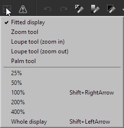
Display magnification can be changed from these menus.- Whole display
Magnify display so that the entire image fits into the display area. - 100%
Display magnification (per pixel) so that one dot of developed RAW data is one dot on the display. - 25%
- 50%
- 200%
- 400%
Change display magnification to each setting. - Zoom in +
Adjust magnification to enlarge one step from the current display magnification. - Zoom out -
Adjust magnification to reduce one step from the current display magnification.
- Whole display
Change display magnification with the slider control
At the bottom of the preview window there is a slider control for changing display magnification.
The slider control is composed of three controls, the slider, a dropdown list and a text box. You can set display magnification using these.Change display position with the scroll bar
When “preview tools” is anything other than “Fitted Display,” vertical and horizontal scroll bars are enabled on the right and bottom of the preview window.
You can adjust the display position using these.
3.2.2.2. Change display position / magnification with the mouse
The relationship between mouse operations and functions in the preview display are determined by the tool mode.
There are five tool modes: “Fitted display”, “Zoom tool”, “Loupe tool (zoom in)”, “Loupe tool (zoom out)” and “Palm tool”.
The following explains how to change display location / magnification in each tool mode.
Fitted display
In this mode, the entire image is displayed so as to fit the image to the preview window. When resizing the window, its display magnification changes automatically according to the window size.
Changing display magnification is possible from the menu, even if the tool mode is “Fitted display”. If the display magnification is changed, the tool mode will automatically switch to “Zoom tool”.
In this mode, you can execute the following mouse operation- Left Double-click
Display magnification becomes 100% and the “Zoom tool” is selected - [Shift] + Left-Drag
The “Zoom tool” is selected and you can change display magnification continuously.
- Left Double-click
Zoom tool
 “Zoom tool” is a convenient tool mode in which you can enlarge or reduce the preview display instantly, and can change the displayed position.
“Zoom tool” has both “Loupe tool” and “Palm tool” functions.
Once you master these operations, you can change the size and position of the preview display very quickly.- Left-Drag
You can grab and move a picture (panning operation). - Left Double-Click
When display magnification is at 100%, the magnification is changed so that the whole image fits on the window (full display). When the display magnification is at other than 100%, the magnification is returned to 100% at which developed pixels are the same as those on the window. Thus, only by left double-clicking, you can switch a magnification value between full display and 100%. This turns out to be a very convenient function. - [Shift] + Left-Drag
You can change display magnification continuously, with the center of changing being at the drag-starting point. You can instantly enlarge or reduce the portion when you want to check in detail. This is very helpful.
- Left-Drag
Loupe tool (zoom in)
 The “Loupe tool (zoom in)” offers a convenient mouse tool mode that can enlarge the image, with the center of enlargement being at the clicking point.
Since this mouse operation has been adopted by a lot of other applications, it appears familiar to many users.
When you operate this tool while pressing the [Alt] key, (zoom in) does not work but (zoom out) works.- Left-Click
Zoom In - [Alt] + Left-Click
Zoom Out
- Left-Click
Loupe tool (zoom out)
 The “Loupe tool (zoom out)” offers a convenient mouse tool mode that can reduce the image with the center of reduction being at the clicking point.
Since this mouse operation has been adopted by many other applications, it appears familiar to many users.
When you operate this tool while pressing the [Alt] key, (zoom out) does not work but (zoom in) works.- Left-Click
Zoom Out - [Alt] + Left-Click
Zoom In
- Left-Click
Palm tool
 The “Palm tool” offers a mouse tool mode that can grab and move a picture (panning operation). This operation similar to the mouse tool mode adopted by many other software.
In addition, when you click on a picture while pressing the [Ctrl] key, the picture size is enlarged with the center of enlargement being at the clicking point.
When you click on a picture while pressing the [Alt] key, the picture size is reduced with the center of reduction being at the clicking point.- Left-Drag
You can grab and move a picture (panning operation). - [Ctrl] + Left-Click
Zoom In - [Alt] + Left Click
Zoom Out
- Left-Drag
You can also enlarge or reduce the preview display with the following operation regardless of the tool mode.
However, when the tool mode is “Fitted display”, it will automatically switch to “Zoom tool”.
- [Ctrl] + mouse wheel
Zoom in or out
3.2.3. Displays of images with default parameters by mouse operations
 You can check images with the default parameters during adjustments in the “Combination mode” or “Preview mode.”
When displaying an adjusted image on the preview window, line the mouse pointer with  on the bottom right corner of the preview window, click on , and while is pressed, the image with the default parameters will be displayed.
Similarly, the default parameters will be displayed while the [Space] key is held down.
While the default parameters are displayed, [Displaying the default parameters] will be displayed in the title bar.
3.2.3.1. Parameters to exclude from the display of default parameters
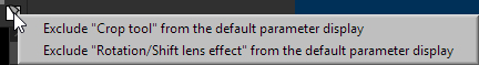 You can set parameters to exclude when the default parameters are displayed by holding down .
In the menu that is displayed by right-clicking , check the parameters you with to exclude.
The following parameters can be set.
- Crop tool
- Rotation/Shift lens effect
For example, if you enable this setting in a cropped image, you can compare it with the default parameters without changing the cropped area.
This setting can also be made in the “Tastes/Parameters” sub-control.
Please see “4.1.2. Tastes/Parameters” for information about the “Tastes/Parameters” sub-control.
3.2.4. Coarse Preview
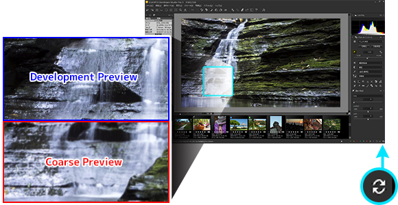
The preview display in the preview window can perform concurrent processing in two formats, the coarse preview that performs simple development processing for quick display of the whole, and the development preview for development processing the exact same as the output image of development results.
If this software need to update the preview display, first use the quick coarse preview.
In the background, parallel processing of partial development preview is performed at the same time. It is updated as display blocks that have completed development preview processing are automatically replaced.
If selected images are switched and development parameters are changed, it may seem at first that the image display is a little rough, but you will understand as details of the image change in order.
When changing development parameters, it is possible to confirm the process at different stages displayed in the coarse preview without having to check the results of development preview processing.
In the coarse preview, the following processes are performed to speed up.
It processes partially culled RAW data according to the display size, and executes a first and simple demosaic process. Therefore, there are sometimes some jaggy and false colors around the outline.
(In the development preview processing, the entire RAW data are processed and a complete demosaic process and color distortion is executed.)It does not process noise reduction, color distortion, sharpening, and other frequency surface filter processing. Therefore, when you modify the parameter “sharpening”, “noise reduction”, “demosaicing sharpness”, “resolution plus”, or “color distortion”, the “preview image” will not be updated during coarse preview.
(In the development preview processing, it processes all filters and the effect of the modified parameter is reflected on the display.)
It processes data as well as the development preview except for the above description. Therefore, “exposure bias”, “white balance”, “tone”, and “saturation” is reflected also in the coarse preview.
3.2.5. Development Preview
 Until development preview processing has been completed, two types of “preview images” are intermingled.
While the  mark is displayed at the right end of the status bar, it indicates that the development preview processing is still under operation and there still remains the result of coarse preview.
When development preview processing is completed, the mark disappears and it indicates that the whole “preview image” has been replaced to development preview”. Then you can check the final development result on the screen.
If you select “Fast rendering (Coarse preview)” from the “Preview rendering method” dropdown list on the “Display settings” dialog, SILKYPIX does not display a development preview when a smaller preview image than its actual size is displayed.
It provides you to reduce the memory consumption and the load of CPU when updating a preview image.
This setting is effective for the PC that has few built-in memories or a notebook PC. Please refer to ‘9.2.3. Preview window’.
3.2.6. Grid Display
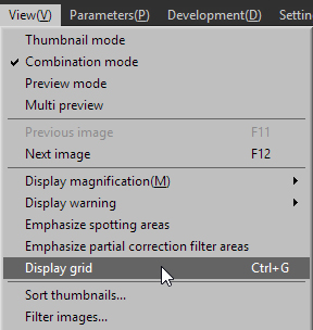 You can display the grid on the preview image in the “Preview mode” or “Combination mode”.
Selecting the menu command [View (V)]-[Display grid] turns the grid on or off.
Even when the grid display is OFF, the grid will be automatically displayed for a set time period while adjusting the “Rotation/Shift lens effect” category in development parameters.
Please refer to “9.2.3.3. Grid Settings” concerning settings in this function.
3.2.6.1. Moving Grid Position
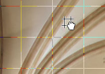 On the Preview window, you can grab and move the grid by the [Ctrl] key + drag operation.
In addition, the [Ctrl] key + left-double-clicking reset the grid to the initial position.
On the Preview window, you can grab and move the grid by the [Ctrl] key + drag operation.
In addition, the [Ctrl] key + left-double-clicking reset the grid to the initial position.
3.2.6.2. Grid settings
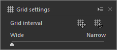 While displaying the grid, the “Grid settings” dialog appears.
You can configure the interval and position of the grid on the dialog, and reset the grid to the initial position, too.
While displaying the grid, the “Grid settings” dialog appears.
You can configure the interval and position of the grid on the dialog, and reset the grid to the initial position, too.
Grid interval
Use the slider to adjust the grid intervals.Move grid
When you click the icon, the operation mode is changed to the “moving grid” mode and the mouse cursor is changed to
  .
.
You can grab and move the grid by dragging.
Once you perform the operation in the moving grid mode, the operation mode is returned to the previous mode automatically.Initialize grid position
When you click the icon, the grid position is initialized.
The grid interval is not changed by this operation. This feature is valid only in a status where a grid position is customized.
3.2.7. Background color
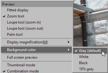 You can select the background color when displaying a Preview from “Background color” in the context menu.
The initial setting is set to “Gray (default)”. There are a total of four colors, “White”, “Black” and “18% gray” in addition to “Gray.” You can make your selection by clicking on the background color.
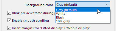 You can also select [Background color] from the [Display settings] dialog.
The [Display settings] dialog will be displayed by selecting [Settings (S)] - [Display settings] from the Menu.
You can choose from the four colors of “Gray (default),” “White”, “Black” and “18% gray” under “Opening a folder in preview mode” in the middle right of the dialog.
3.3. Thumbnail window
You can select multiple images and perform operations on selected multiple images as a batch in the thumbnail window.
3.3.1. Selecting Multiple Images
3.3.1.1. Selecting multiple images
When you left-click on an image while pressing the [Ctrl] key, you can select the image keeping other image selected. If you repeat this operation, you can select multiple arbitrary images.
When you left-click on an image while pressing the [Shift] key, you can select the images together from the clicked image to other selected image.
3.3.1.2. Select all images
When you press the [Ctrl] and [A] keys at the same time, or click the menu command [Edit (E)]-[Select all images], you can select all the images on the window.
* When the Preview Window is in Multi-preview Mode, multiple images cannot be selected.
3.3.1.3. How to Change “Representative Image” when Multiple Images are Selected
When multiple images are selected, the selected image with a border brighter than the others is called the “Representative Image”.
The image of the representative image is displayed in the Preview Window.
Please see “7.7. Operations for Multiple Selected Images” concerning the representative image.
The method for selecting / changing the representative image differs depending on the display mode and settings for “Thumbnail Scroll Direction” under display settings.
Please see “9.2.2.1.2. Thumbnail scroll direction” concerning thumbnail scroll directions under display settings.
When Thumbnail Scroll Direction is “Vertical direction” or in Thumbnail Mode
You can change the representative image by pushing the [Left] or [Right] key.
Please note that if you push the [Up] or [Down] key that multiple image selection mode will be cancelled.When Thumbnail Scroll Direction is “Horizontal direction”
You can change the representative image by pushing the [Up] or [Down] key.
Please note that if you push the [Left] or [Right] key that multiple image selection mode will be cancelled.
The above operations are the same whether selecting images from multiple rows or multiple columns.
3.3.2. Sort thumbnails
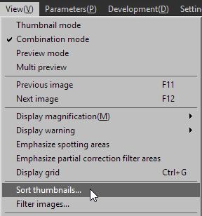 You can specify the display order of the thumbnail.
Using the menu command [View (V)]-[Sort thumbnails] or clicking the [Sort thumbnails] button on the “Display settings” dialog.
Set rules for arranging thumbnails in the order you prefer in the “Sort thumbnails” dialog.
3.3.2.1. Control description
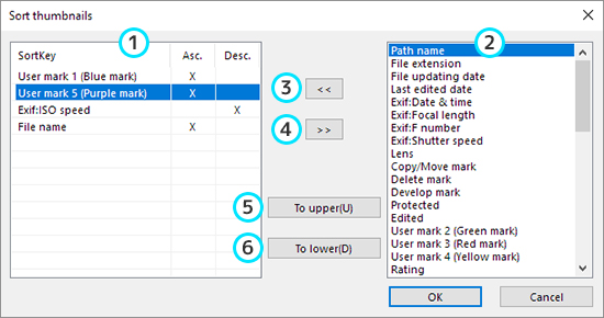
List of sorting keys
You can specify the order of the sorting key on this list. The sorting key is applied in turn from top of the list.
“Ascending order” displays in order from small values to larger values, but if marked, set images are displayed first and images not set displayed after those.
“Descending order” is displayed in reverse order to “Ascending order.”
And you can specify whether ascending order or descending order to each sorting key.Unused sorting key list
A list of keys that can be added as sorting keys is itemized.
When selecting one key on the list and clicking the (3) button, you can add the key to the bottom of the list of (1).Add sort key
When clicking this button, the sort key selected on the (2) list will be added to the bottom of the list of (1).Remove sort key
When clicking this button, the sort key selected on the (1) list will be removed.To upper
When clicking this button, the sort key selected on the (1) list will be moved upper of the list..To lower
When clicking this button, the sort key selected on the (1) list will be moved lower of the list..
3.3.3. Changing the Size of Thumbnails
The size of thumbnails can be changed using any of the following methods.
Changing the size by operating the mouse wheel over thumbnails
You can change the size of thumbnails by holding down the [Ctrl] key and operating the mouse wheel over thumbnails.Changing the size in Display settings
You can change the width of images in the Display settings dialog.
Please refer to “9.2.2. Thumbnail window” for details.Changing the size in each display mode
You can change the size using the following methods in the Thumbnail mode and Combination mode.[Changing the size in Thumbnail Mode]
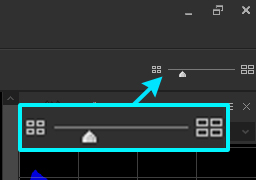 You can change the thumbnail size with the “Image width in thumbnail window” slider on the right of the toolbar.
[Changing the size in Combination Mode]
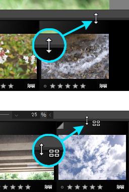 When the thumbnail window is located either above or below, you can change the size of thumbnails within the boundary between the preview window and thumbnail window to a range of one third from the right side by dragging up or down under
  conditions by aligning the mouse pointer.
In addition, if you align the mouse pointer to the remaining two thirds of the range and drag up or down under conditions, you can change the number of rows of thumbnails displayed, without changing the thumbnail size.
When the thumbnail window is located to either the left or the right, you can change the size of thumbnails within the boundary between the preview window or thumbnail window to a range of one third from the bottom by dragging left or right under conditions by aligning the mouse pointer.
In addition, if you align the mouse pointer to the remaining two thirds of the range and drag left or right under conditions, you can change the number of columns of thumbnails displayed, without changing the thumbnail size.
3.4. Operations for selected images
3.4.1. Marks
 You can make marks for operating and managing images.
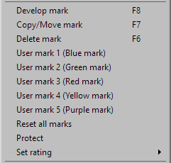
By right clicking on a thumbnail or preview image, a context menu will appear, from which you can select marks and clear marks.
Delete mark
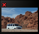 This is a mark added to an image you want to delete.
After marking, you can move images marked for deletion as a batch to Trash box through [File (F)]-[Delete marked images (E)] from the menu.
Copy/Move mark
 This is a mark added to an image you want to copy or move.
After marking, you can copy or move images marked for copying or moving as a batch through [File (F)]-[Copy marked images (C)] or [Move marked images (M)] from the menu.
Develop mark
 By setting develop marks, you can develop multiple images in a batch from [Development (D)]-[Batch develop marked images (B)] from the menu.
User mark 1 (Blue mark)
 By setting User mark 1 (Blue mark), you can use blue marks as tags.
User mark 2 (Green mark)
 By setting User mark 2 (Green mark), you can use green marks as tags.
User mark 3 (Red mark)
 By setting User mark 3 (Red mark), you can use red marks as tags.
User mark 4 (Yellow mark)
 By setting User mark 4 (Yellow mark), you can use yellow marks as tags.
User mark 5 (Purple mark)
 By setting User mark 5 (Purple mark), you can use purple marks as tags.
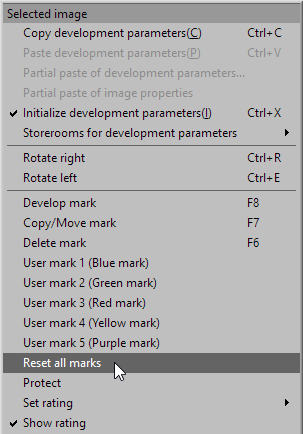 To clear marks from an image, right click on a thumbnail of a marked image to display a context menu.
Select “Reset all marks” to delete all set marks.
To cancel individual set marks, select a mark for deletion from the context menu.
Furthermore, you can also set and clear marks, other than “Rating” (*1), by selecting icons located on the status bar.
 A maximum of eight kinds of marks can be set to a single image.
The following combinations can be set.
Delete mark or Copy/Move mark
Develop mark
User mark 1 (Blue mark)
User mark 2 (Green mark)
User mark 3 (Red mark)
User mark 4 (Yellow mark)
User mark 5 (Purple mark)
[Maximum 5] Ratings (*2)
*1 See “3.4.3. Rating” for details concerning how to set “Rating.”
*2 When the image width on two thumbnails is under “129 pixels,” “Rating” is not displayed.
3.4.2. Protect
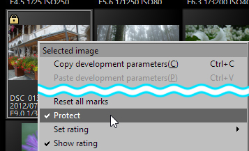 SILKYPIX protect is not for setting attributes of the RAW data file image for processing.
SILKYPIX protect prohibits moving or deleting files and changing development parameters during SILKYPIX operations.
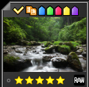
Protected images are displayed with  in thumbnail displays and on the status bar.
To cancel the “Protect” setting, right click on the thumbnail or preview display and use the context menu, or use “Development settings” “sub-control.
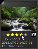
3.4.3. Rating
You can set the class of images by setting the number of stars with “Rating.”
In addition, you can sort set ratings with “ “Filter images,” “Sort thumbnails,” etc.
You can save additional information when set “Ratings” are saved on JPEG/TIFF image files.(*)
* See “9.1.4. JPEG/TIFF options,” “(3) Discard SILKYPIX parameters and image information” regarding details on how to make settings on JPEG/TIFF image files.
3.4.3.1. Setting and Clearing “Ratings”
Thumbnail mode
 Set the number of stars by clicking on
  or dragging under each image in thumbnail window.
Click to clear the set stars.
- When performing batch operations on multiple images
You can set the number of stars on all images in a selected batch by clicking on or dragging under any of the images when multiple images are selected.
You can clear the number of stars on all images in a selected batch by clicking on under any of the images when multiple images are selected.
- When performing batch operations on multiple images
Preview mode
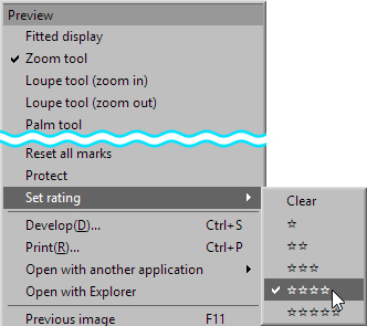 By right clicking on the preview, you can select and set the number of stars from the menu items at “Set rating.”
Remove the set stars by selecting “Clear.”
Image properties
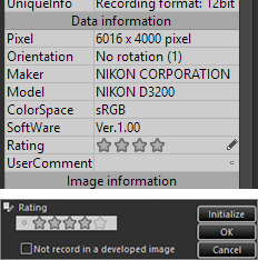 The “Rating” window opens when you align the mouse pointer with “Rating” under “Image properties” and click on
  .
.
Click to set the number of stars.
Click to return the set number of stars to the number of stars embedded in the image.
In addition, if you click , the setting of number of stars will return to default, so the number of stars will return to the number of stars embedded in the image.
- When set rating is not reflected in development (saved) results
When you set the number of stars with a check at “Not record in a developed image” and click the [OK] button, this rating will not be recorded when developing.
In addition, under conditions when the number of stars is not set, “Not record in a developed image” is unavailable, and it cannot be used.
Therefore, this item is unavailable even if you click to set the number of stars to default.
When you click the [OK] button, the set contents is reflected on the “Rating” and the “Rating” window closes.
If you click the [Cancel] button, the contents you were operating on will not be reflected and the “Rating” window will close.
- When set rating is not reflected in development (saved) results
3.4.3.2. Filtering images by “Rating”
You can filter and display images according to the set rating.
See “3.4.6. Filtering images for processing” concerning filtering images.
3.4.3.3. Sort thumbnails by “Rating”
You can sort thumbnails according to rating.
See “3.3.2. Sort Thumbnails” concerning how to sort thumbnails.
3.4.3.4. Switching between Display / Non-Display of “Rating” at the top of the thumbnail.
 You can switch between Display / Non-Display of “Rating” on the thumbnail.
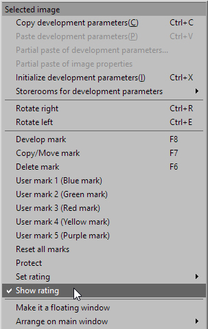
Right click on the thumbnail to activate the Context Menu.
 By clicking on the “Show rating” item from the open Context Menu and removing the check mark, you can remove the rating from each image of the thumbnail, and it will not be displayed.
3.4.4. Switching to previous / next image
 If there are multiple images being operated on, click on
  to go to the image prior to the currently selected one or on
  to go to the next image.
3.4.5. Rotating images
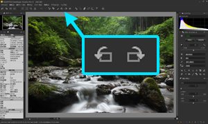 Rotate the image of the currently selected image.
The image is rotate left when you click on  and rotate right when you click on
  .
.
3.4.6. Filtering images for processing
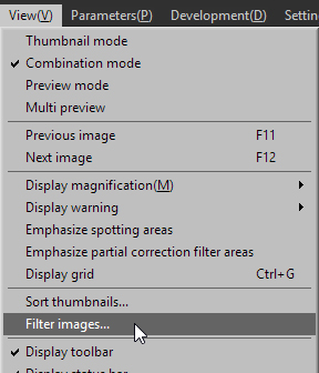 You can filter images for development, such as marked images and selected images.
There are two ways you can filter images.
One method is by selecting [View (V)]-[Filter images] from the menu and designating filtering conditions from the “Filter images” dialog. The other is by moving your mouse over the  icon located to the lower right of the thumbnail window and designating “Filter images” from the pop-up window.
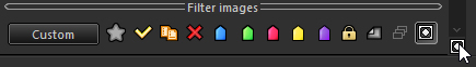 You can filter marked images and selected images with one click in the “Filter images” pop-up window.
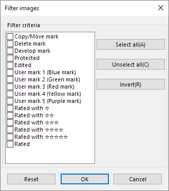 You can filter using more sophisticated conditions, such as images with multiple marks, in the “Filter images” dialog.
Canceling the “Filtering images” is also done from these dialogs and pop-up window.
When images for processing are filtered, “Filtering images” will be displayed in the title bar.
In “Filtering images” mode, images not filtered will temporarily be removed as subject to processing.
When “Filtering images” mode is cancelled, all images will return to status as images for processing.
“Filtering images” will be automatically cancelled if a new file or folder is opened or if added and opened.
“Filtering images” will remain open if images are individually closed with the “Close selected images” function.
3.4.7. Search in the thumbnail
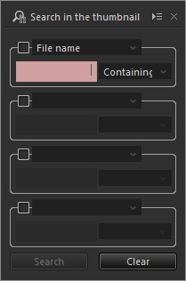 Search in the thumbnail is a function for filtering images for processing from thumbnail images by specifying conditions such as file name and photographic information.
You can also perform searches so that multiple conditions are all met.
You can display the Search in the thumbnail sub-control by selecting [View(V)]-[Search in the thumbnail] from the menu, or the  icon in the toolbar.
3.4.7.1. Search method
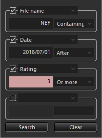 After clicking the check box, select the item to be searched from the list.
Enter optional numerical values and characters in the text box below.
In order to perform searches so that multiple conditions are all met (AND searches), click the check box below as well and add search items.
If you click the [Search] button, images for processing will be filtered by search conditions.
In order to clear images for processing filtered by Search in the thumbnail, click the [Clear] button.
Once images for processing are filtered, [Filtering images] will be displayed in the title bar.
In the “Filtering images” mode, images that are not filtered will be temporarily removed from the filtered image.
When a new or additional file or folder is opened, “Filtering images” will be automatically cleared.
3.4.7.2. List of search items
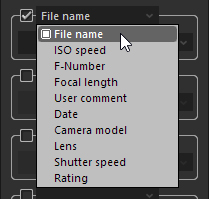 Search in the thumbnail can be performed by the following items.
Items that can be searched by numerical values
- ISO speed
- F-Number
- Focal length
- User comment
- Rating
- ISO speed
Items that can be searched by characters
- File name
- User comment
- Camera model
- Lens
- File name
Items that can be searched by dates
- Date
- Date
3.5. Arranging parameters controls and sub-controls
Parameters controls and sub-controls are located to either side of the main window, the tab page and control box. You can freely change the location such as displays in windows independent of the main window.
If you drag a floating window and adjust its position, and if another floating window is nearby, a function that automatically arranges floating windows will come into play.
Automatically grouped floating windows can be moved as a group.
Changes to display methods are performed through the context menu displayed by clicking  at the upper right of each sub-control.
Please see “0.1.7. How to Locate Controls” concerning context menus.
Utilize these functions to customize the arrangement of windows and make your work easier.
3.5.1. Types of Locations
There are the following types of location methods. The method for selection location depends on the control.
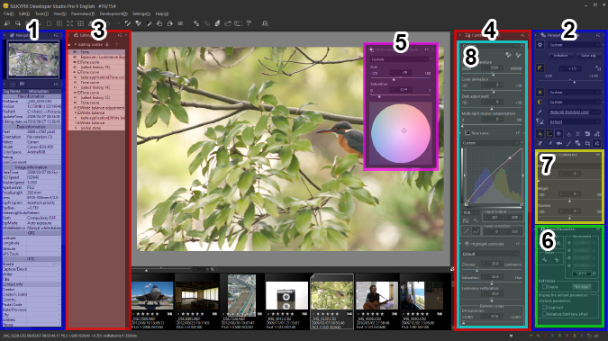
Arrange to left of main window
They are located in the Information Box on the left side of the Main Window.
The Navigator and Histogram are at the top of the Information Box, while other controls are located at the bottom.Arrange to right of main window
They are located in the Information Box on the right side of the Main Window.
The Navigator and Histogram are at the top of the Information box, while other controls are located at the bottom.Arrange to left of preview window
They are located between the left side of the preview window or thumbnail window and the Information Box.Arrange to right of preview window
They are located between the right side of the preview window or thumbnail window and the Information Box.Make it a floating window
They are displayed as a window independent from the Main Window.Fix in control box
Sub-controls that can be displayed at all times may be located in a “Control Box”.
Multiple sub-controls can be located in a “Control Box”.
By selecting from icons and menus under “Parameters controls”, sub-controls located in a “Control Box” can be scrolled to until their location is visible.Locate it on the tab page
Sub-controls displayed as Category Selection Icons can be displayed in the “Tab Page”.
Only one sub-control can be displayed on the “Tab Page”. You can switch the displayed control by clicking on the Category Selection Icon.Place on a control palette
Sub-controls that can be displayed at all times may be located in a “Control Palette”.
Multiple sub-controls can be located in a “Control Palette”.
There are four “Control Palettes” (1 to 4), and they are all displayed in different locations in the default parameters.
Please see “3.5.3. Place on a control palette” for details.
3.5.2. Types of arrangement available for each control
The following types of arrangement are available for each control.
Types of arrangement available
- Arrange to left of main window
- Arrange to right of main window
- Arrange to left of preview window
- Arrange to right of preview window
- Make it a floating window
- Fix in control box
- Locate it on the tab page
- Place on a control palette
- Arrange to left of main window
| Control/Sub-controls | (1) | (2) | (3) | (4) | (5) | (6) | (7) | (8) |
|---|---|---|---|---|---|---|---|---|
| Parameters controls | * | * | * | * | * | — | — | — |
| Control palette | * | * | * | * | * | — | — | — |
| Editing history | * | * | * | * | * | — | — | — |
| Folder | * | * | * | * | * | — | — | — |
| Image properties | * | * | * | * | * | — | — | — |
| Search in the thumbnail | * | * | * | * | * | — | — | — |
| Navigator | * | * | — | — | * | — | — | — |
| Histogram | * | * | — | — | * | — | — | — |
| Category selection icons (*) | — | — | — | — | * | * | * | * |
| White balance adjustment | — | — | — | — | * | * | — | * |
| Tone curve | — | — | — | — | * | * | — | * |
| Highlight controller | — | — | — | — | * | * | — | * |
| Fine color controller | — | — | — | — | * | * | — | * |
| Lens aberration controller | — | — | — | — | * | * | — | * |
| Rotation/Shift lens effect | — | — | — | — | * | * | — | * |
| Development settings | — | — | — | — | * | * | — | * |
| Effects |
— | — | — | — | * | * | — | * |
| Monochrome controller |
— | — | — | — | * | * | — | * |
| Underwater photo controller |
— | — | — | — | * | * | — | * |
| Spotting tools | — | — | — | — | * | — | — | — |
| Partial correction tool |
— | — | — | — | * | — | — | — |
| Crop tool | — | — | — | — | * | — | — | — |
| Display grid | — | — | — | — | * | — | — | — |
| Batch development status | — | — | — | — | * | — | — | — |
| Color management | — | — | — | — | * | — | — | — |
* “Tastes/Parameters”, “Exposure / Luminance”, “White balance”, “Tone”, “Color”, “Sharpening” and “Noise reduction” sub-controls are displayed under “Category Selection Icons”.
3.5.2.1. “Collapse / Expand” Controls
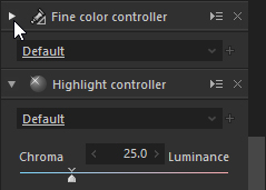 When sub-controls are located in the Control Box or a Control Palette, you can choose to display only Tastes in order to effectively use the screen.
By clicking on  displayed in the upper left of the sub-control, it will collapse so that only the Taste Selection Drop Down List is displayed. (*)
Click on  to restore the collapsed sub-control to its original condition.
Sub-controls can also be collapsed or expanded by double-clicking on its title bar.
* Sub-controls without the Taste Selection Drop Down List will be collapsed so that only the title bar will be displayed.
3.5.2.2. “Collapse / Expand” Information Box
When sub-controls are located in the Information Box, you can collapse the entire Information Box to temporarily hide it by clicking  or
or  displayed at the upper left of the sub-control.
Particularly in a low screen resolution environment, the screen can be used effectively by collapsing the entire Information Box to temporarily expand the preview area.
In order to restore the collapsed Information Box to its original state, click or displayed in the collapsed portion.
expanded
left side of main window collapsed
This function also applies to sub-controls arranged to “left/right of main window” as indicated in (1), (2), and “left/right of preview window” as indicated in (3), (4) of “3.5.1. Types of Locations”.
3.5.3. Place on a control palette
 Control palettes are sub-controls that can have multiple sub-controls placed inside.
Control palettes have four sub-controls (1 to 4).
The default display locations of each control palette are as shown below.
Control palette 1
Left of preview windowControl palette 2
Right of preview windowControl palette 3
Left of preview windowControl palette 4
Right of preview window
As with the Control Box inside a parameters controls, sub-controls placed inside can be collapsed and expanded.
If a control palette is closed with sub-controls placed inside, all the sub-controls placed inside will be hidden.
If the hidden sub-controls are displayed from this state by clicking a category selection icon or sub-control icon or by other means, the closed control palette will open, and all the sub-controls placed inside will be displayed.
3.5.4. Grouping Floating Windows
All controls displayed as floating windows can be arranged freely, but they can also be set up together and moved collectively as a group.
Setting up floating windows
If you move the display location by dragging a floating window with the mouse, when it comes close to the side of another floating window, it will automatically be attached to the closest side.
You can set floating windows neatly by using this function.
Floating windows that have been attached together can be moved as a group.Moving as a group unit
Floating windows that have been attached together can be moved as a group.
Drag the title bar of the floating window you want to move to change the display location of the floating window.
When doing so, if you drag the left half of the title bar, all floating windows grouped together will be moved collectively.
If you drag the right half of the title bar, or if you drag while holding down the [Ctrl] key, only that floating window will be moved.
When you move the mouse over the title bar, the mouse cursor will become over the left half and
  over the right half.
Determine which action will take place by looking at the shape of the mouse cursor.
3.5.5. Registration and restoration of window positions
You can restore the location of each control by registering each control position and selecting the registered location data.
By registering the location of each control according to its purpose, you can use them while switching control locations according to usage or purpose of operations.
3.5.5.1. Register window positions
You can register the location of controls by selecting [Settings (S)]-[Register window positions] from the Menu.
3.5.5.2. Restore window positions
You can restore the registered control location by selecting [Settings (S)]-[Restore window positions] from the Menu.
3.6. Toolbar position
The display position of the toolbar can be changed from the menu that is displayed by right-clicking on the toolbar.
The available positions are as follows.
Arrange to top of main window
The toolbar will be arranged at the top of the main window.
This is the default position.Arrange to left of main window
The toolbar will be arranged to the left side of the main window.
Icons will be arranged vertically.Arrange to right of main window
The toolbar will be arranged to the right side of the main window.
Icons will be arranged vertically.
* This setting will be saved for each skin size that can be selected in “9.9.3. Select skin”.
When the skin size has been changed, this setting will change as well according to the size.
3.7. Turning floating window display on / off
This function turns off and restores to original status displayed sub-controls that are floating together in a group.
Temporarily turning off this display will help if many sub-controls are displayed on the screen, making the preview display and thumbnail display difficult to view.
This function is assigned to a shortcut key only ([F9] by default).
After using this function and turning a display off, if you display sub-controls through another method, you will not be able to return to the original status using this function.
3.8. Icons that show status of image
The status and designated reservations / marks for each image are shown with icons in the thumbnail display and status bar.
 : This shows that the development parameters of the image have been edited.
 : This shows that the image is cropped.
- : This shows that the image is protected.
 : This shows that the image is marked for deletion.
 : This shows that the image is marked for moving / copying.
 : This shows that the image is marked for development.
 : User mark 1 (Blue mark) is added to the image.
 : User mark 2 (Green) is added to the image.
 : User mark 3 (Red mark) is added to the image.
 : User mark 4 (Yellow mark) is added to the image.
 : User mark 5 (Purple mark) is added to the image.
 : This shows that only temporary editing is allowed on this image.
If parameters are edited, they will be cancelled when concluded. : This shows that parameters from previous versions are applied on the target image.